Creating different types of images!

This week’s challenge was to create different groups of photos and video.
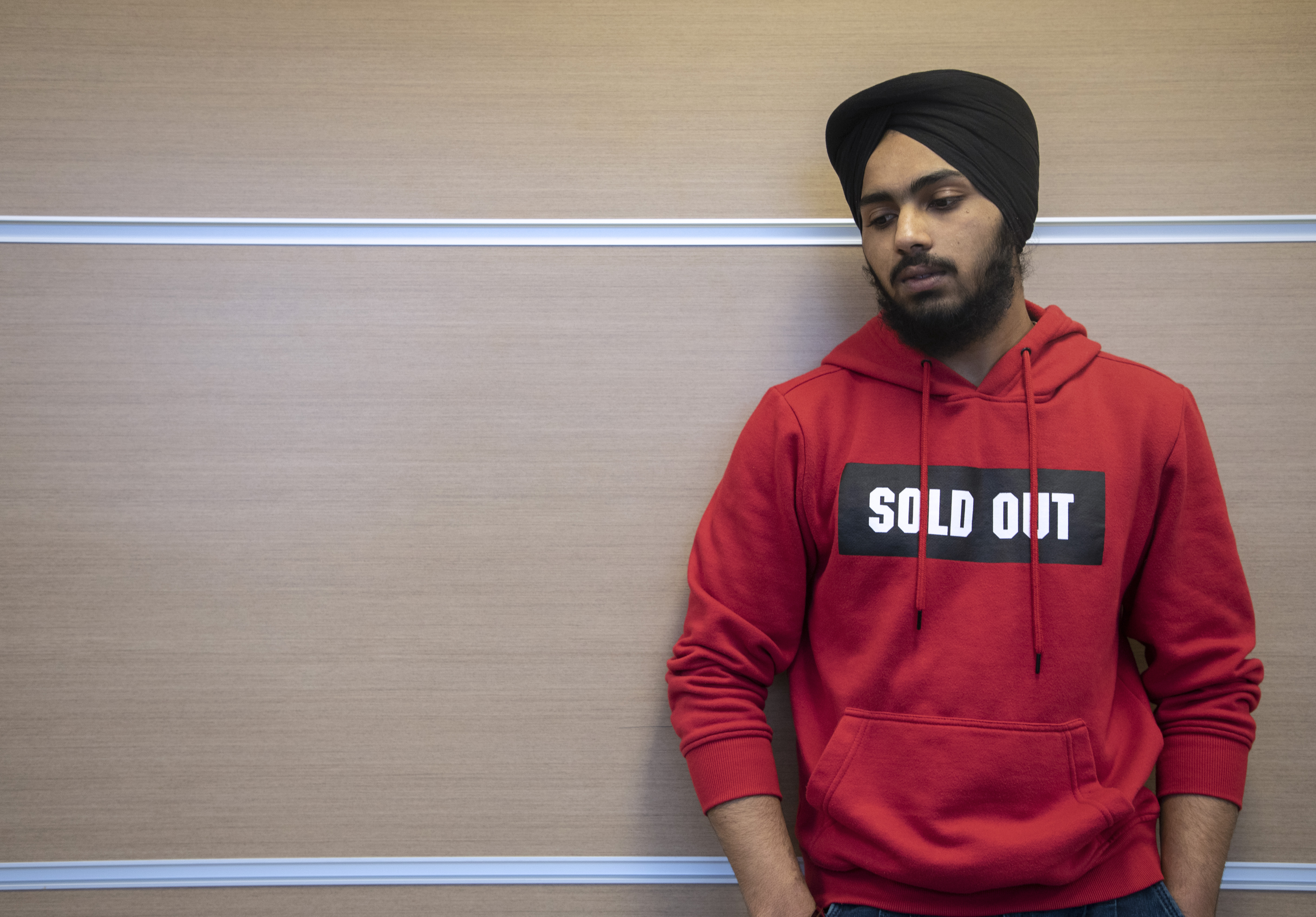
The first was to use a theme color to compose the pictures. I chose red. I tried to match the colors of the model’s clothing with the environment. Look at the result!

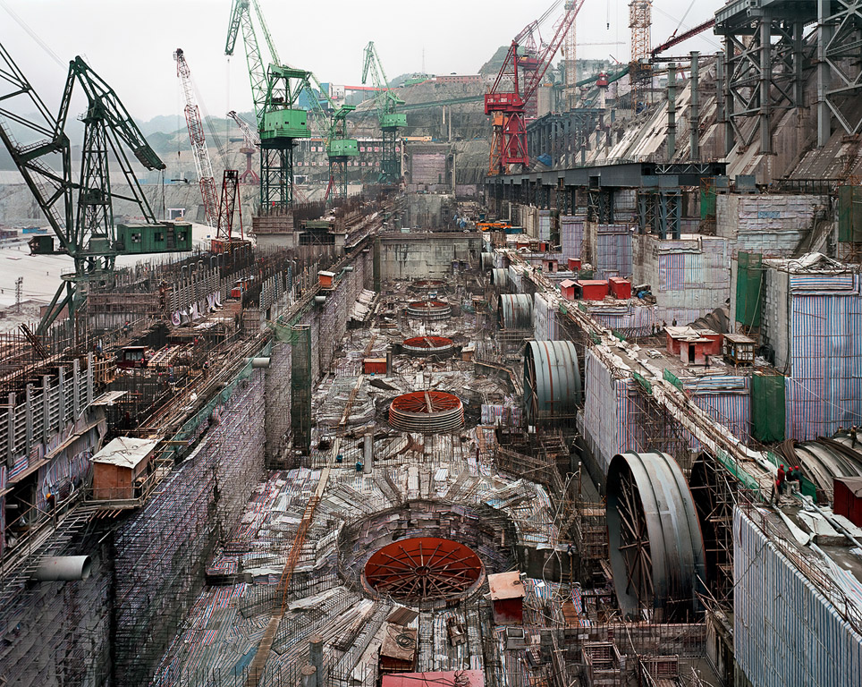
The second was to find different textures. I found some different ones, like stones, water, lamps from a restaurant, and even old jeans. It was really fun to see how much we are surrounded by different textures.

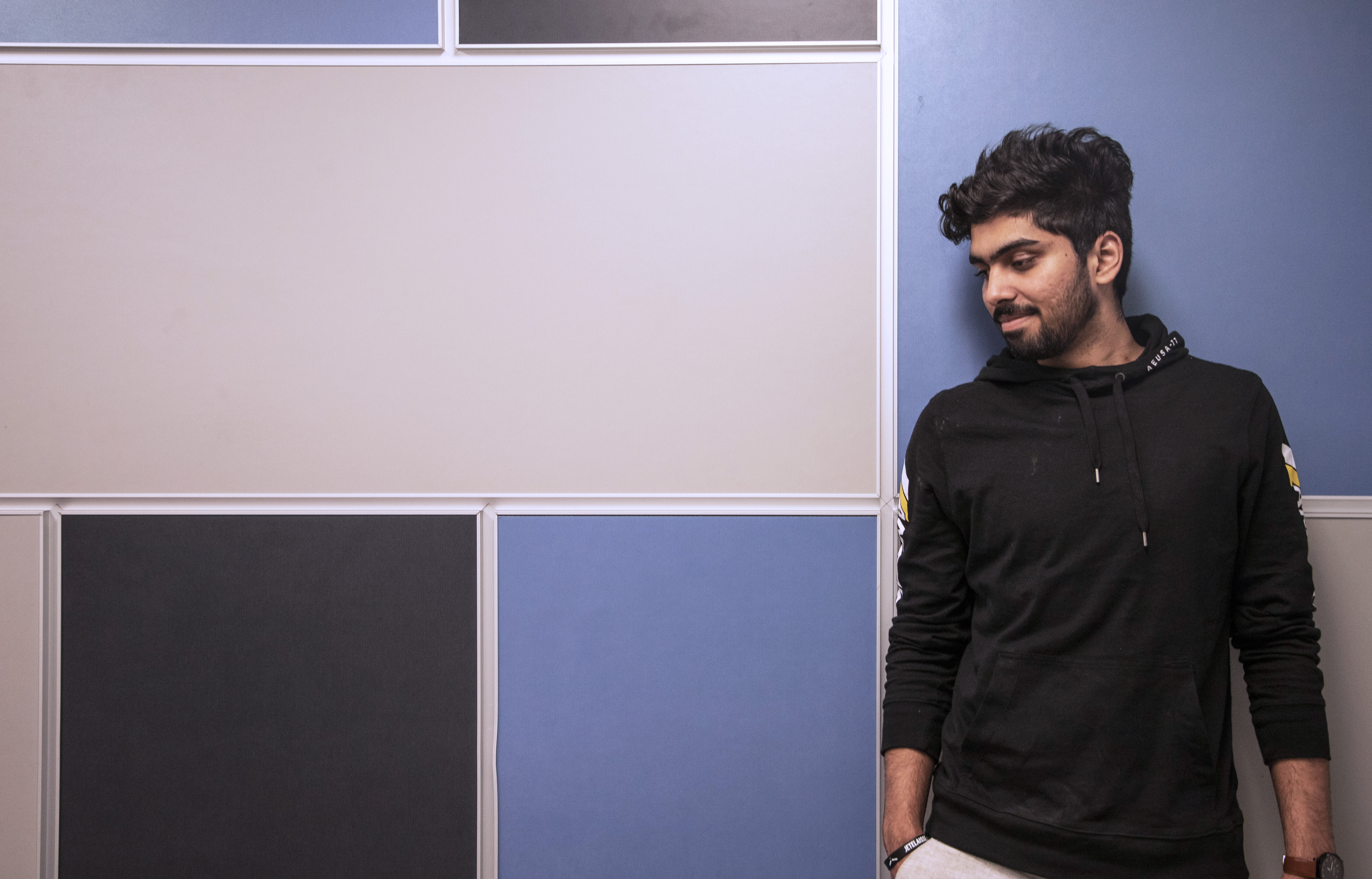
Much used in advertising pictures, I also had the opportunity to photograph people with negative space. This kind of photography I especially like very much because you can create a mystery tone, drama, and the opportunity to fill the space with whatever you need.

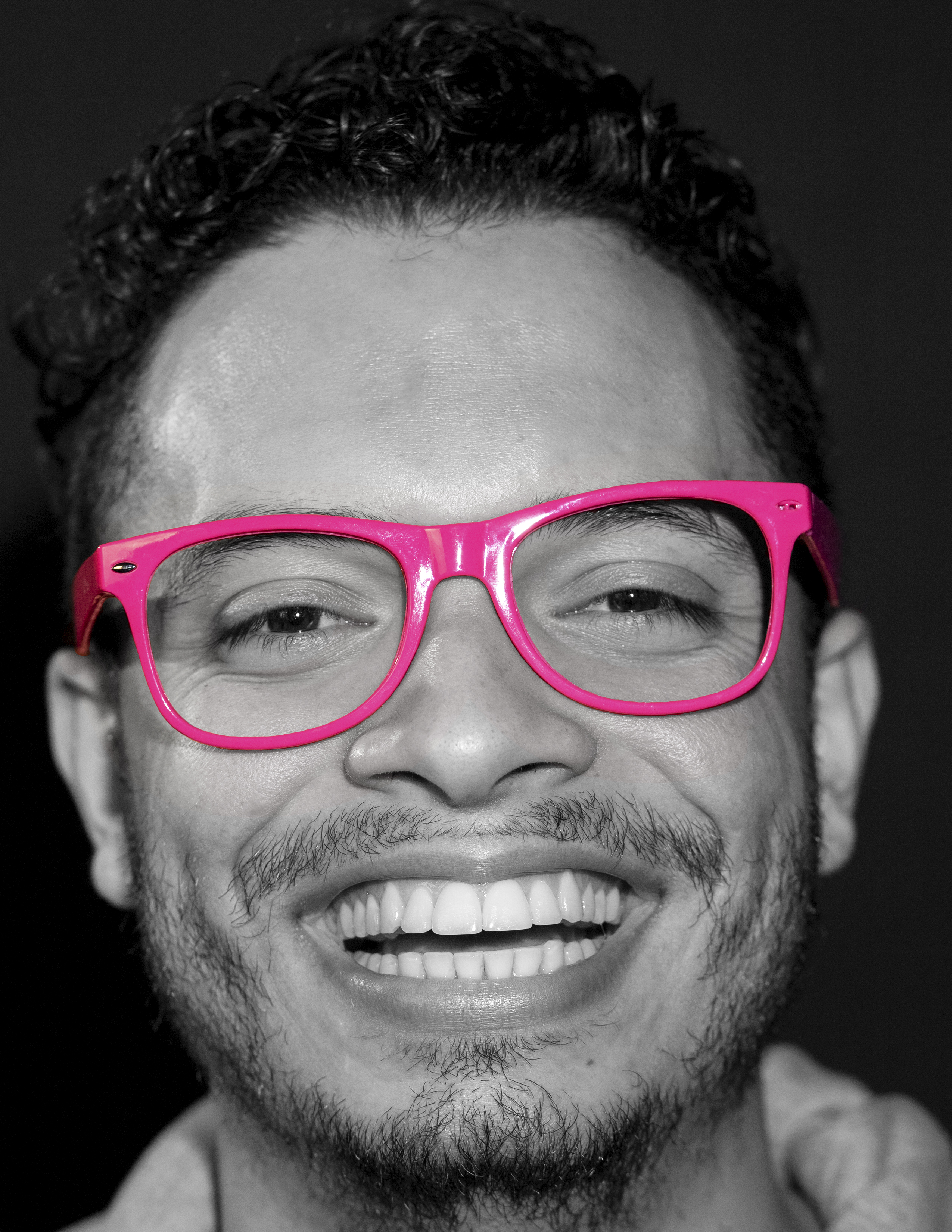
My favorite group of photos was the one below, where I could use low saturation. In some, you are able to see a bit of colour, but in a very subtle way, or you can get to black and white, which is my passion. Look at the result!

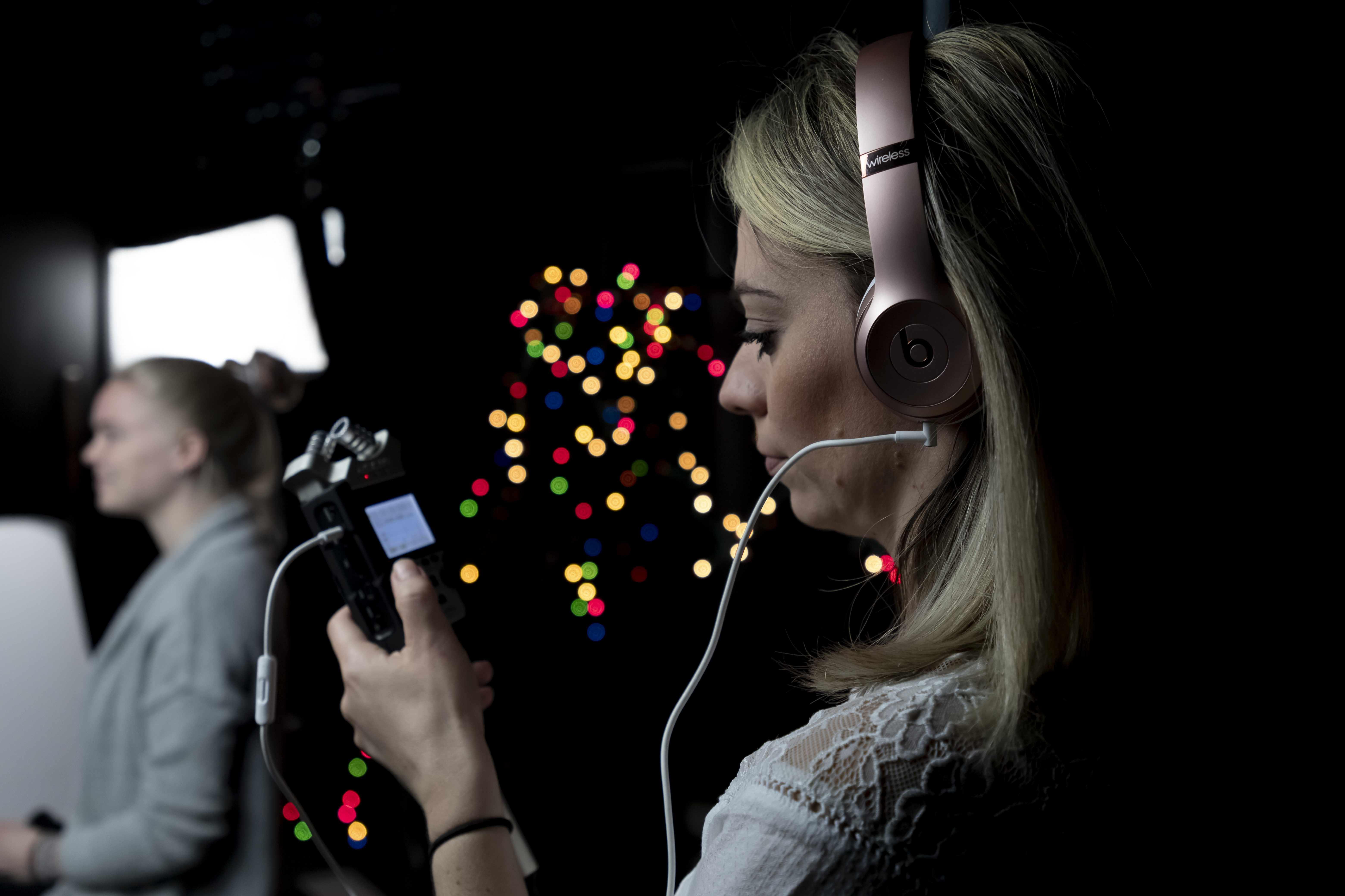
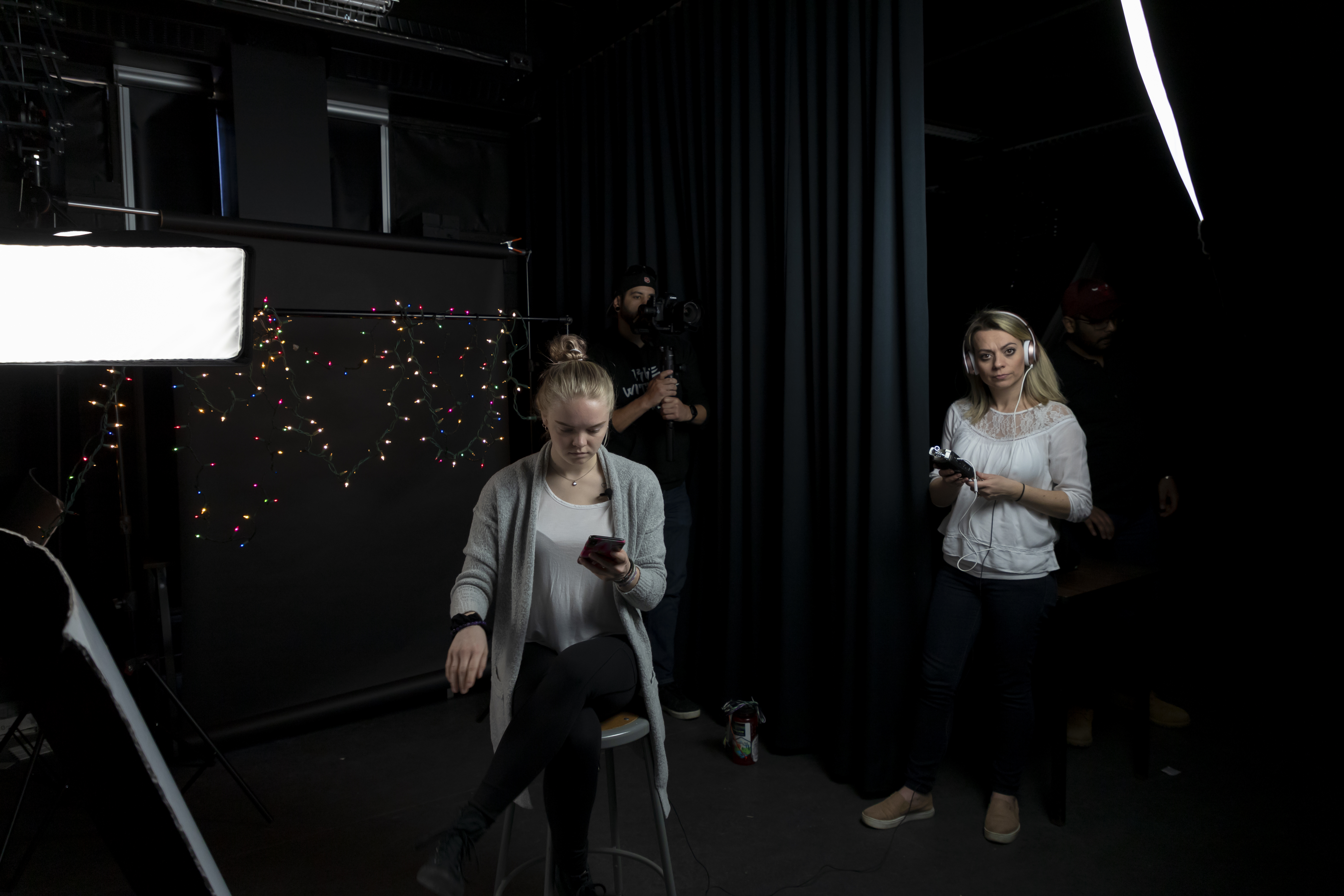
And finally, I made some videos where I managed to capture different types of nationalities in a multicultural country like Canada. Look that!

BEHIND THE SCENES | INTERVIEW

Today was the day of filming an interview. The subject was about our program at Durham College – Video Production. When you see this composite scenario behind the interviewee, can you tell how it was done? Does it look complicated to you? But it is not! 

 To compose the scenario, we create depth of field in the background using Christmas lights which created a special effect. The result was incredible. We also used 2 lights, one to lighten her face and another to balance the background and her back at the same time.

Furthermore, we used an external audio kit (lapel) to make the interview clearer and not capture the overall studio audio.

The interview was done with a Canon 6D Mark II camera. In addition, with this same model of the camera we created the behind the scenes and photos of our production. Take a look!

Shooting a toy car…

Today I had the incredible experience of photographing a toy. When you look at the end result, you can hardly imagine what it took to achieve that result. Looks like magic.

To create this picture, we used a simple toy car, white felt, mini pine trees left over from Christmas, properly exposed lights and a good camera – Canon 5D Mark IV. To compose the snow, we use confectioner’s sugar and a sieve to spread the sugar and generate more reality.

During the photos, we could check the best angles until we get the best photo.

Also, we tried to use the reflector to creat extra light. And works!

Later in the edition, we were able to add a bit more color, lights on the headlight of the car and more snow to create a more realistic look yet.

You can check every detail in this video below.

Breast Cancer Campaign

This is another awareness campaign whose main objective is to alert women and society to the importance of prevention and early diagnosis of breast cancer. According to International Agency for Research on Cancer (IARC), breast cancer is the most commonly occurring cancer in women and the second most common cancer overall. There are over 2 million new cases in 2018. 

Furthermore, breast cancer is the most common cancer among Canadian women. It is the 2nd leading cause of death from cancer in Canadian women. Breast cancer can be detected in early stages, in most cases, thus increasing the chances of treatment and cure.

All women, regardless of age, can know your body to know what is and what is not normal in your breasts. It is important for women to observe their breasts whenever they feel comfortable to do so (whether in the bath, when changing clothes or in another daily situation), without specific technique, valuing the casual discovery of small breast changes. Most breast cancers are discovered by the women themselves. If you find anything different, seek medical advice immediately.

These photos were taken in the studio with men wearing pink glasses to alert everyone how important early diagnosis is. In addition, husbands, brothers, and friends can help women take care of themselves and remind them of the importance of self-examination and prevention. To compose these photos, I used 3 points of light (key light, fill light and hair light), wide lens, and tripod. They were edited in black and white leaving only the apparent pink color that represents the color of the breast and woman cancer campaign.

Wedding Videos x The Right Professional

Wedding movies should be able to thrill. But for that, you need to have competent professionals, who can get the best images and do the right editing. To achieve this result, you need a perfect combination of soundtrack and exceptional images, and this is only achieved if you have an experienced and dedicated professional team. Conveying emotion is what really holds people’s attention.

Filming your wedding does not boil down to the record of the big day itself. Good professionals offer complete options that can start with the proof of the dress and finish with the aid in choosing the photos for the album closure. Pre-wedding rehearsals and movies are a strong trend and record very striking moments in your love story. Another trend in the market is to make a short video of about 4 minutes so that the couple can post to social networks as soon as possible, and a second video with about 20 minutes to store more details of the big day and show friends closer.

If what is important is the emotion, the chosen professional should produce films capable of making you feel moved, even if you do not tell your story. An important part of a video maker’s job is to get to know the couple so they know their preferences, references, and expectations because it is this information that allows them to create the perfect movie. Of course, this work is not done individually, and a team with multiple specific skills is essential

Anyone who thinks that to make a wedding movie just turn on the camera and go out through the filming of the aisles, is completely wrong. There is a whole preparation and script previously rehearsed between the team so that no outrage occurs so that no fundamental moment is lost. In a shoot, it is necessary that at least two professionals are present. This is because for a good edition different plans are needed, but the precise definition of the ideal team size should take into account local and number of event guests. But be aware: many cameras can get in the way of work if there is no clear direction, as professionals can appear in each other’s image.

Besides, it is not enough to be enchanted by wonderful presentations, because sometimes they do not portray the real profile of the company. It is crucial that you look for references and know which professionals will be with you during filming. Knowing the quality and the maintenance of the equipment is also paramount, as this is what guarantees the technical quality of the image capture and, without good raw material, it is difficult to achieve the desired editing and final result. Incidentally, do not forget to check how the files will be manipulated and finalized.

Always choose the team that creates a strong bond with couples, that seeks excellence in work and that has as a priority personalized service and commitment to the result. A good professional knows the exact time to eternalize feelings, emotions, joys, and details. All this is part of the marriage and everything can be revived with the same emotion years later.

Teleflix – avoid annoying people

This is Teleflix’s newest commercial for Family Day. Made especially for you that owns an account and needs to share it with all the family and friends who do not get tired of asking for the password.

PS: Why do not they take notes?

But to solve this kind of annoyance we decided to bring the gifts cards with different values so that you can give the ones you love, but do not want to see them changing the profile of your Teleflix account. Also, now you can find them at any store in the city.

It was a fun video to be recorded and edited. Besides, I’m sure a lot of people will identify with our protagonist. You can even share this video so your ‘family and friends’ can also identify themselves. Maybe they will stop disturbing you, right?

Edward Burtynsky and his crazy and nice pictures

Photo: © Birgit Kleber 2012

Edward Burtynsky is a Canadian photographer and artist known for his large-format photographs of industrial landscapes. The most famous photographs of Burtynsky are known for showing in a dazzling way landscapes modified by the industry.

Its inspiring and beautiful images portray the environment and how the human being compromises it. His idea is to make human beings aware of the impact each one has on the planet.

Water
Dyralaekir River on Myrdalssandur
Iceland, 2012

“[we] come from nature.…There is an importance to [having] a certain reverence for what nature is because we are connected to it… If we destroy nature, we destroy ourselves.” – Edward Burtynsky

Mines
Silver Lake Operations #2
Lake Lefroy, Western Australia, 2007

He is an award-winning fine art photographer whose work is featured in the collections of over 60 major museums worldwide.

It is possible to find his pictures in diverse places, like his personal Website, Facebook, Twitter, and Instagram. Places where it divulges and explains each project, facilitating the access of people throughout the world and collecting fans and followers.

 
Dam #6
Three Gorges Dam Project, Yangtze River, China, 2005

His last project called Anthropocene, shows much of the passion of the photographer in being in the middle of nature.

Furthermore, Anthropocene is four years in the making feature documentary film from the multiple-award-winning team of Jennifer Baichwal, Nicholas de Pencier, and Edward Burtynsky.

Cerro Dominador Solar Project #1
Atacama Desert, Chile, 2017
Dandora Landfill #3
Plastics Recycling, Nairobi, Kenya, 2016
Anthropocene – The Human Epoch Trailer

Never doubt the power of a mother!

One of the most watched videos on the internet over the last few weeks shows the power of an angry mother.

This mother, somewhere in Mexico, was arguing with her daughter. The daughter turns her back on her mother and walks out. The mother, with the right aim, throws apparently a heavy slipper, that practically flies by many meters and reaches the head of the daughter.

Whether it’s real or not, we do not know, but the whole world is watching and laughing a lot! Furthermore, it reminds us of how our mothers, when they want, have the power to do unimaginable things.


Blue life…

Today was the day to observe and photograph the color blue. For those who do not know, all colors have meanings and convey sensations to humans.

Blue color transmits and enhances understanding. It is the color of well-being and logical reasoning. It is the only one that has the power to disintegrate negative energies, favoring patience, kindness, and serenity.

In addition, according to experts, the color blue helps lower blood pressure, calms and brings mental clarity. It produces tranquility, tenderness, affection, peace of mind and security. Reduces stress and anxiety by promoting emotional health.

It favors intellectual activities and meditation. It symbolizes devotion, faith, high aspirations, sincerity, confidence, and tranquility. It is also very suitable for hyperactive children’s and adults rooms.

I decided to look for different things or that are so common in our day to day that we often do not even notice them.

Some pictures:

1) In this photo, I noticed this pair of sneakers between the legs of the chairs. A framing composition. I really liked the contrast of the colors between the blue and the yellow of the background.

2) Here, a simple sticker on the glass, with the important and strong message “You are beautiful”. In this photo, I used the Deth of Field technique to blur the background. It was also necessary to change the exposure of the camera so as not to have an overexposure background.

3) In that other photo, a common everyday scene, a portrait of a man with his blue headset. But when you notice the composition, you realize that the tone of the photo is bluish. The Glass, the stickers on the glass, the details of the tie, and even his hair, which with reflected light, created a slight bluish. I also liked the contrast with purple, another cool color in the composition.

4) When you see this picture, no writing is necessary for you to understand the message. It is a common symbol, which the world knows – recycling. The color in blue, along with the white symbol translate the lightness and responsibility in caring for the environment. A simple frame with a good focus.

by Rosemeire Zabel